Figure 3-6. Margin properties and values.
Alignment Styles
Elements on a Web page are normally blocked at the left margin of the page or at the left margins
established by their margin or margin-left style properties. It is often the case, that you may wish
to change this default alignment, and align a page element at the right margin, center it horizontally
on the page, or "float" the element to the left or right to permit text flow around the sides of the
element.
The text-align Style
The text-align style property permits left, center, right, or justified alignment of text within
elements. Its property settings are shown in Figure 3-10.
| Property |
: |
Values |
|
text-align
|
left
center
right
justify
|
Figure 3-10. Text alignment property and values.
The text-align style property is replacement for the deprecated align attribute previously used for
<p>, <hn>, and <hr> tags. From this point forward,
all horizontal alignment of text should be done with the text-align property.
Paragraph Alignment
A <p> tag surrounds a block of text which has its individual lines blocked at the left
margin of the page or at the left margin established by the paragraph's margin or margin-left style
setting. A text-align style can be applied to the paragraph to change this default left-alignment display.
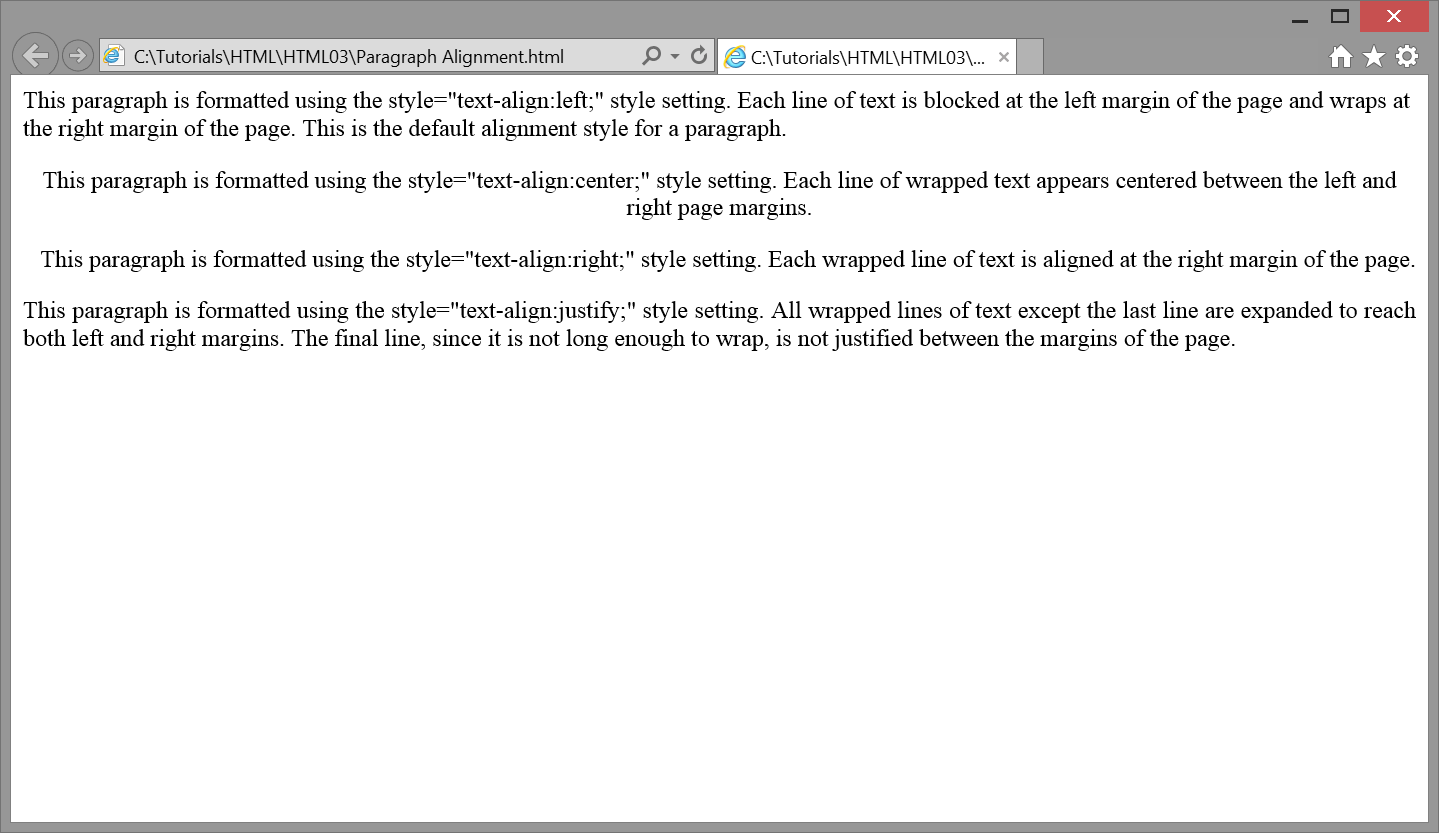
The following code creates four paragraphs that each have an in-line style sheet to apply different text
alignments. Browser display of these paragraphs is shown in Listing 3-20.
    <p style="text-align:left;">
    This paragraph is formatted using the style="text-align:left;" style
    setting. Each line of text is blocked at the left margin of the page and
    wraps at the right margin of the page. This is the default alignment
    style for a paragraph.</p>

    <p style="text-align:center;">
    This paragraph is formatted using the style="text-align:center;" style
    setting. Each line of wrapped text appears centered between the left and
    right page margins.</p>

    <p style="text-align:right;">
    This paragraph is formatted using the style="text-align:right;" style
    setting. Each wrapped line of text is aligned at the right margin of the
    page.</p>

    <p style="text-align:justify;">
    This paragraph is formatted using the style="text-align:justify;" style
    setting. All wrapped lines of text except the last line are expanded to reach
    both left and right margins. Since the final line is not long enough to
    wrap, it is not justified between the margins of the page.</p>
Listing 3-20. Setting paragraph alignments with in-line style sheets.

Figure 3-11. Various paragraph alignments displayed in browser window.
In this example, all four paragraphs have a different styling. Thus, <p> tags are
styled with in-line style sheets rather than with an embedded or linked style sheet which would produce
common styling for all paragraphs. Keep in mind, that text alignment which should be shared by all
paragraphs on a page should appear one time only in an embedded or linked style sheet. If it is decided
that all paragraphs on a page will have justified lines, then an embedded style declaration for the p
selector is appropriate.
    <style>
      p {text-align:justify;}
    </style>
Listing 3-21. Setting alignment for all paragraphs with an embedded style sheet.
If it is further decided that all paragraphs on all pages of a Web site will have justified paragraphs,
then this embedded style sheet can be promoted to a linked style sheet for sharing among all pages.
Heading Alignment
Text alignment styles can be applied to <hn> tags to place headings at the left,
in the center, or to the right of a page. In the following example, the text-align property is
applied to an <h2> heading with an in-line style sheet to center it horizontally
on the page. This style property replaces the older align="center" attribute previously used to align
headings.
<h2 style="text-align:center;">Centered Heading<h2>
Listing 3-22. Setting alignment for a heading.
It is normally the case that various headings used on a Web page will have common styles in order to
enforce a common look for the page. Therefore, it is common practice to include heading alignment in
an embedded style sheet for sharing among all like headings. The following code gives alignment styling
for three heading sizes that appear on a page. Furthermore, top margins are increased to leave additional
vertical blank space between the headings and preceding text.
    <style>
      h1 {text-align:center; margin-top:20px;}
      h2 {text-align:left;   margin-top:20px;}
      h3 {text-align:left;   margin-top:20px;}
    </style>
Listing 3-23. Setting alignment styles for all headings on a page.
Although text alignment is not required for the above <h2> and <h3> tags
(since left is the default alignment), these settings are included in the style sheet to make them
explicit and to documentation the settings. Also, since all heading alignments appear in this embedded
style sheet, any changes to heading alignments can be made at this single location for propagation
across all headings on the page.
Centering Images
Image alignment takes place by first converting the image from an inline element to a block-level element
using the CSS display property, and setting its value to block. Next, the CSS properties margin-left
and margin-right styles are applied with a value set to auto. For example, coding to center an image
on the page is given in the following in-line style sheet.
<p><img style="display:block;margin-left:auto;margin-right:auto;" src="Stonehenge.jpg" alt="Stonehenge"></p>
Listing 3-24. Centering an image in the page.
| Property |
: |
Values |
|
display
|
block
inline
|
Figure 3-12. Display property and values.

Figure 3-13. Centered alignment of an image.
Image resources have an inherent width value. When margin-left and margin-right are both set to auto,
the browser calculates the amount of space available, minus the width of the image, and divides it
evenly between the left and right margins. For other block-level elements which have no inherent
width length, you must specify a width in order to horizontally center the element.
Floating Images
Alternative to positioning a picture on a line by itself is to place it at the left or right margin
and permit word wrap around it. The picture is said to "float" to the left or right of its accompanying
text. Floating an image makes use of the float style property.
| Property |
: |
Values |
|
float
|
left
right
none
|
Figure 3-14. Float property and values.
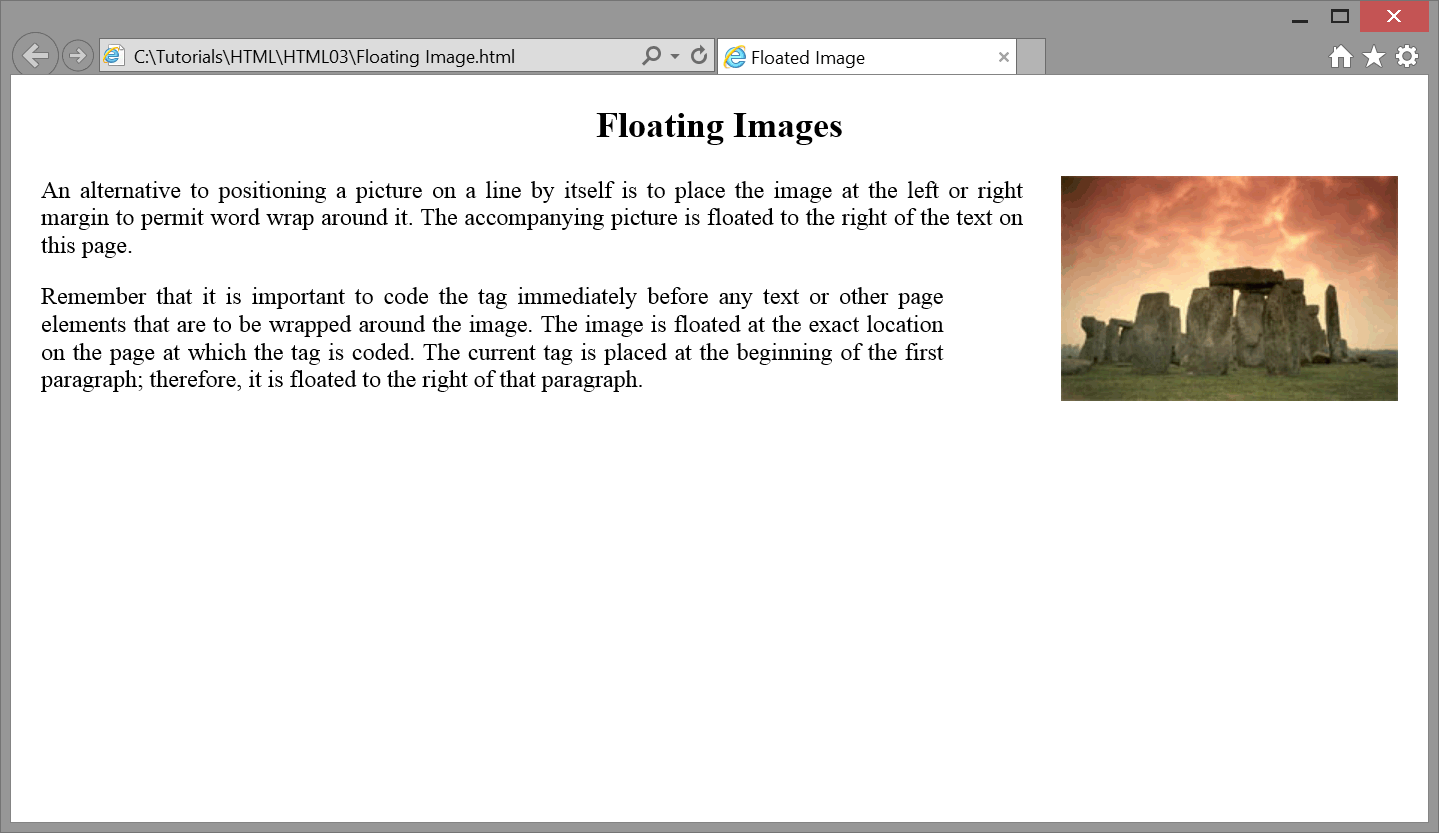
The picture in Figure 3-15 appears at the right margin of the page (floated right). The accompanying text
paragraphs wrap around the image. All styling is contained in an embedded style sheet.

Figure 3-15. A floated image.
    <head>
      <title>Floated Image</title>
      <style>
        body {margin:20px;}
        p    {text-align:justify;}
        h2   {text-align:center;}
        img  {float:right; margin-left:25px;}
      </style>
    </head>

    <body>
    <h2>Floating Images</h2>

    <p>
    <img src="Stonehenge.jpg" alt="Picture of Stonehenge">
    An alternative to positioning a picture on a line by itself is to place the
    image at the left or right margin to permit word wrap around it. The
    accompanying picture is floated to the right of the text on this page.</p>

    <p>Remember that it is important to code the <img> tag immediately
    before any text or other page elements that are to be wrapped around the
    image. The image is floated at the exact location on the page at which the
    <img> tag is coded. The current tag is placed at the beginning of
    the first paragraph; therefore, it is floated to the right of that
    paragraph.</p>
    </body>
Listing 3-25. Code to float an image to the right of a page.
Notice that the float property is associated with the img selector in the above style sheet.
It is a property of the <img> tag -- the tag to be floated -- unlike the case where
an image is placed on a line by itself and is aligned by the text-align property of its enclosing
<p> tag.
Images that are floated to the left or right of the page must be coded immediately before any text that
wraps around the image. In the above example, the <img> tag appears at the beginning
of the paragraph that wraps around the image. No line breaks appear between the image and its
surrounding content. The <img> tag is assigned the float:right style property to
place it at the right margin of its enclosing paragraph. It also has a margin-left: 25px
style setting in order to leave white space between the picture and its surrounding text on the left.
Images can be floated to the left or right of the page; they cannot be placed in the middle of the page
with word wrap around both sides. When floating images, it is usually a good idea to include additional
white space between the image and its surrounding text by extending its margins. Like most style
properties, the float property can be applied to many other tags. In later tutorials you will learn
how to float text containers to the left or right of a page.
In the above example, all tags are styled with an embedded style sheet. Although not shown here,
any other <p>, <h2>, and <img> tags appearing
on this page would take on these same styling characteristics.
Wrapping Text Around Images
When images are floated to the left or right of the page, subsequent text wraps around the image.
This is illustrated in Figure 3-16 where an image floats to the left so that a caption for the image
wraps to its right. At the same time, a follow-on paragraph also wraps around the image.
Here is a captioned image that is floated to the left so that its caption appears on its right.
 Figure 1.
The Passion of the Western Mind
Figure 1.
The Passion of the Western Mind.
This following paragraph also wraps to the right of the picture, since it is coded in the
line below the caption.
Figure 3-16. A floated image with text paragraphs wrapped around it.
     <p>Here is a captioned image that is floated to the left so that its caption
    appears on its right. </p>

     <div>
     <img src="book.gif" alt="Book picture" style="float: Left(); margin-right:10px; margin-bottom:10px">
     <b>Figure 1. </b> <br>
     <i>The Passion of the Western Mind </i>.
     </div>

     <p>This following paragraph also wraps to the right of the picture since it
    is coded next in line below the caption. </p>
Listing 3-25. Code to float an image with text paragraphs wrapped around it.
The clear Property
Although any subsequently coded text wraps around a floated image, you might not want this to happen.
For instance, in the following display the picture caption wraps to the right of the image; however,
the follow-on paragraph, rather than being wrapped around the image, appears below the image.
Here is a captioned image that is floated to the left so that its caption appears on its right.
 Figure 1.
The Passion of the Western Mind
Figure 1.
The Passion of the Western Mind.
This following paragraph appears below the picture rather than wrapped in-line below the caption.
Figure 3-17. A floated image with a follow-on paragraph appearing below the image.
Code to produce this display is shown below.
     <p>Here is a captioned image that is floated to the left so that its caption
    appears on its right. </p>

     <div>
     <img src="book.gif" alt="Book picture" style="float: Left(); margin-right:10px; margin-bottom:10px">
     <b>Figure 1. </b> <br>
     <i>The Passion of the Western Mind </i>.
     </div>

     <p style="clear:left">This following paragraph appears below the picture
    rather than wrapped in-line below the caption. </p>
Listing 3-26. Code to display text at a clear left margin.
You can ensure that a page element always appears at the left or right margin of the page by assigning
it the clear style property. The value of this property can be left, right, both, or none (default).
| Property |
: |
Values |
|
clear
|
left
right
both
none (default)
|
Figure 3-18. Clear style property and values.
In the previous example, the follow-on paragraph is given the in-line style setting clear:left;.
This means that the paragraph is displayed on the next available line that has a "clear" left margin.
Therefore, the paragraph begins on the line immediately below the picture, on the first line whose
left margin is not occupied by another element.
Any time a page element is floated to the left or right of the page, you may need to ensure that a
subsequent text or graphic element appears below the floated element rather than being displayed as
part of the wrapped content. The value of the clear property assigned to this non-wrapped element
depends on the margin location (left or right) of the floated element. The setting clear:both
ensures that neither margin is occupied by a page element before displaying the so-styled element.
The text-indent Style
Previous examples of left-aligned paragraphs show them in "blocked style" wherein all lines of text
are blocked at the left margin. It is common practice to indent the first line of a paragraph as a
visual clue that this is the beginning of a new paragraph. First-line indention is not really
necessary when paragraphs are separated by blank lines as is the case with Web pages. Still, you
may wish to apply this formatting to soften the look of your pages.
The text-indent style property is used to indent the first line of a paragraph. The amount of
indention is given in number of pixels or as a percentage of the width of the page.
| Property |
: |
Values |
|
text-indent
|
npx
n%
|
Figure 3-19. Text indention property and values.
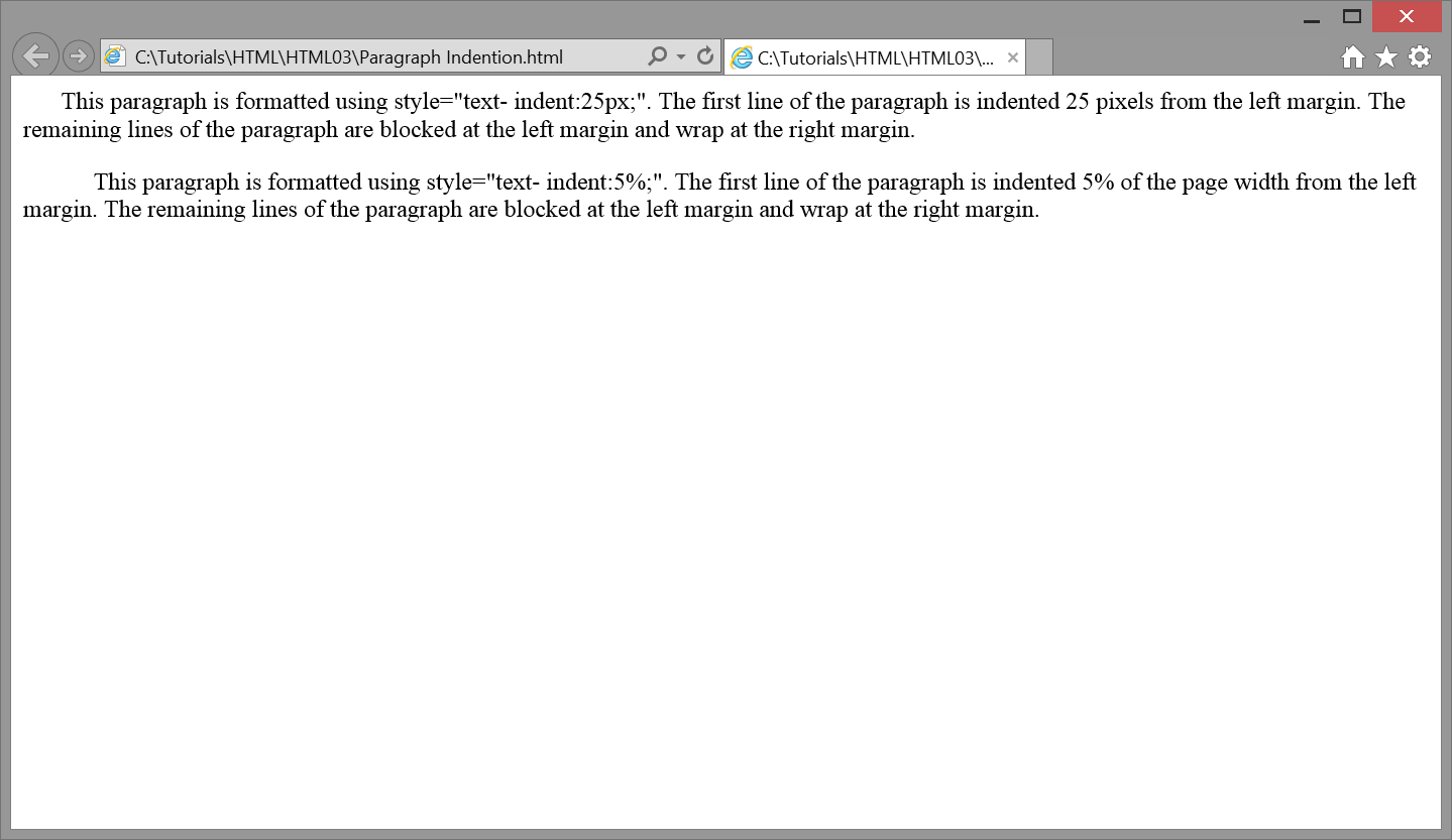
The following code indents the first line of two paragraphs: the first by 25 pixels and the second by
5% of the width of the page. Browser output is shown in Figure 3-20.
    <p style="text-indent:25px;">This paragraph is formatted using style="text-
    indent:25px;". The first line of the paragraph is indented 25 pixels from the
    left margin. The remaining lines of the paragraph are blocked at the left
    margin and wrap at the right margin.</p>

    <p style="text-indent:5%;">This paragraph is formatted using style="text-
    indent:5%;". The first line of the paragraph is indented 5% of the page width
    from the left margin. The remaining lines of the paragraph are blocked at
    the left margin and wrap at the right margin.</p>
Listing 3-27. Setting first-line indentations for paragraphs.

Figure 3-20. Text indentations applied to paragraphs.
In this example, both pixel and percentage values produce approximately the same amount of
first-line indention. When using a percentage measure for paragraph indention, remember that
this value is based on the width of the page. Different amounts of indention will occur depending
on the width of the browser window. In order to maintain a fixed amount of indention regardless of
window size, use a pixel or em value rather than a percentage.